For those who do not understand
fala, AMAG PT #04, 2023 Link


Six projects, three built and three ongoing. Just a few. Enough. Small in scale. Domestic. Familiar. Of simple gestures. What kind of simplicity is it? Projects that appear local, not exotic. Projects that belong. A mixture of old and new elements. Beautifully imprecise. Unpredictable. Kindly irritating.
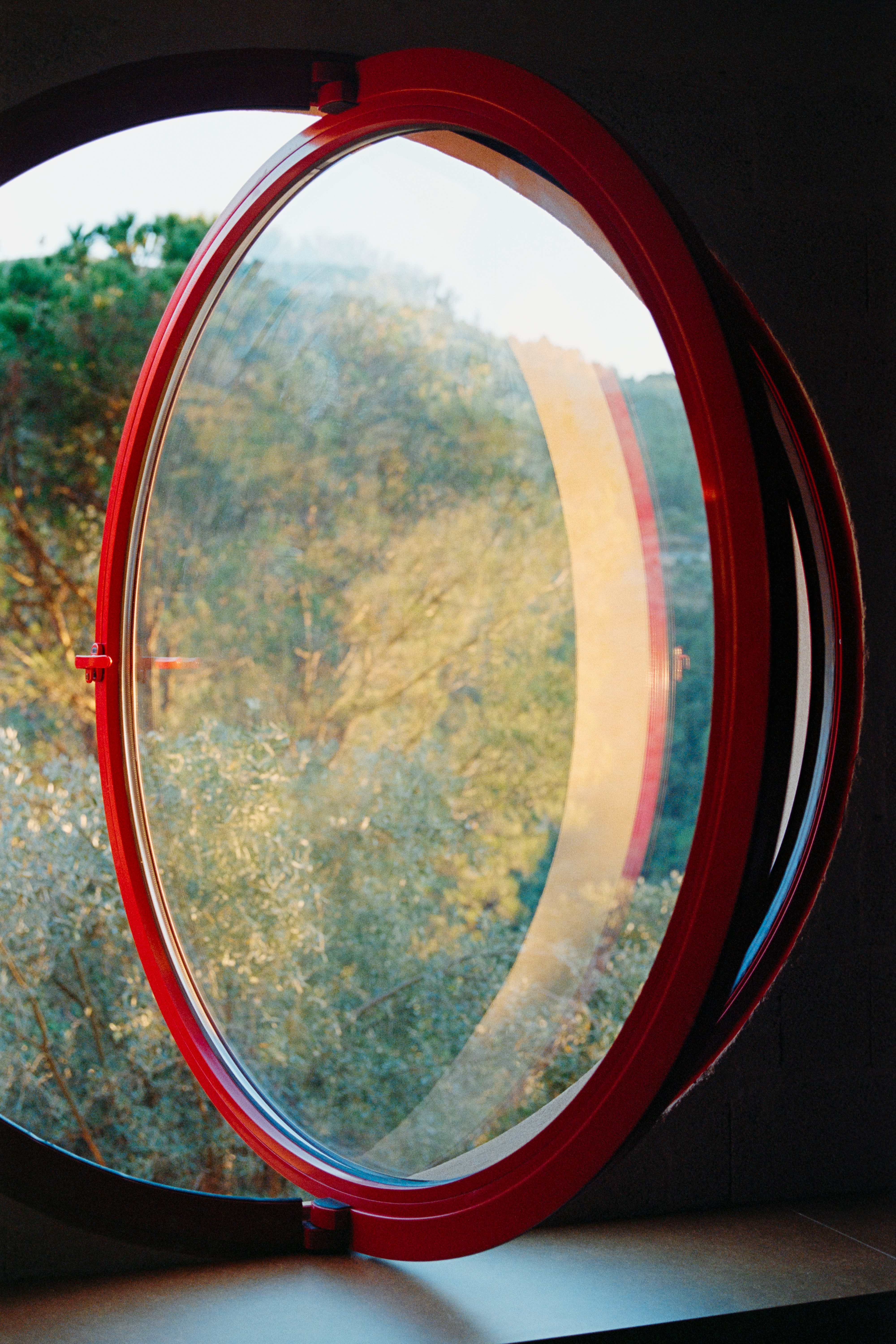
Cheapness and generosity at the same time. Standard elements and materials that are occasionally subverted. Budgets of less than 500€/m2. An extreme (yet deliberate?) economy of means. Maybe. Kind of. Minimalist in means, maximalist in intentions. A french vibe. No copies. No impersonation. No tiles that imitate wood. No plastic. No propaganda. Things are often exposed instead of disguised. Granite and cinderblock walls left exposed. A shade of green instead of plain white. Materials from a catalogue subverted by a vivid colour. Moments of red, pink, dark blue, and dark green. Seven buckets of pink paint applied over walls, drainpipes, cornice, and plinth. Pink skirting, pink shutters, pink door and window frames. Colour, blasphemous. Just colour. Conventional colours in drawings. What is left, What is added. What remains and what is removed. Alternating gaps, holes. Seventeen cut-outs in walls and surfaces. Trusting the process. Dealing with municipal idiots. Fighting the good fight. Knowing how to talk with clients. Losing, sometimes. 6 rooms under precious beams interconnected through a series of occasional, yet precise, voids. A sort of low-cost raumplan. Layers of stone, brick, plaster, old and new. Revealed and hidden. Mistakes and found elements. About 43m2 of exposed mdf and osb panels. Four heavy wooden trunks crossing spaces. Sleeping next to a primitive beam. Avoiding climatization. Wearing an extra piece of clothing if necessary. Letting the walls breath. “Passive construction”. Architecture in a broader sense. A quarter of circle niche accommodating a small window. All kinds of windows. One window that unfolds into a bench that functions as a skylight for the basement. Elements that collaborate. Some collaborations and nearly no collaborators. An atelier with a window to the street. A street with a window to the atelier. Living and working in the same building. Building that building until today. Building an idea of living. Merging concepts of behaviour and space. Experiencing geometry. Marking a yellow cut-out in the shape of a tilted square celebrating technical connections. A kind of baldessari move over a boring problem. Problems as advantages. Rotating another square, in plan. And another one, this time with a column inside. The column is not rotated. Another column is circular. Downstairs two columns again: another circle and another square, both fat. Witty, right? Three pairs of tilted glass doors enclosing existing windows produce small winter gardens. Three round windows, one big and two small, all frames painted in red. Diagonal walls in plans. A plan that is a diagonal wall. The project is a diagonal. The entrance is also a triangle. The front façade is great. The back façade is dull. Deliberately, it seems. Granite cladding handrail-less steps. A broken drainpipe for the rain, painted in red. Two mirror-clad sliding doors. Thirty-six wooden beams, more or less. Axonometric projections of windows. Axonometric drawings, with colour. Overall perspective. The need to see all the drawings at once. Projects that seem the same, but are not. Spaces that seem from different projects, but are not. Many contradictions. A few hesitant curves in plan. Curved plywood. Sustainability, for real. The right kind in the right amount.
Intelligent and intelligible perspectives. Understanding how to frame a narrative is also a sign of intelligence. Atelier local is good. Simple and good. So good it is almost annoying. And it will annoy a few. Mostly because they are good at something others don’t understand. Sometimes because they will provoke, which is even better.
Mathematics of rooms, elements, materials, colours, and square meters. Mathematics of mistakes, intentional and occasional. Mathematics of projects. Mathematics of an architectural practice. Measuring and recounting as an attempt to comprehend. Projects conceived out of bits and pieces. Mild juxtapositions. Gentle collages of elements and spaces. What one sees is what one gets. Simple whole instead of difficult whole. Simplicity over complexity? Some kind of moderation. Some kind of language to be defined. Some kind of dialogue to be built. What kind? With a couple of flemish scents. Almost international. Within an unfortunate context. Fortunately local.